Ars Materia
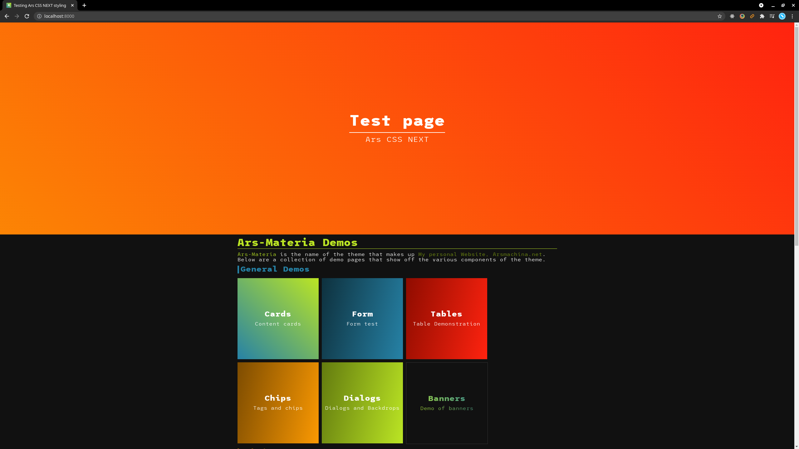
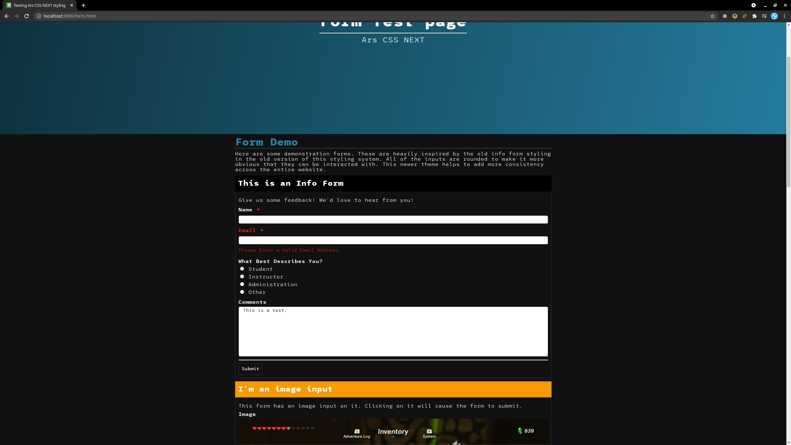
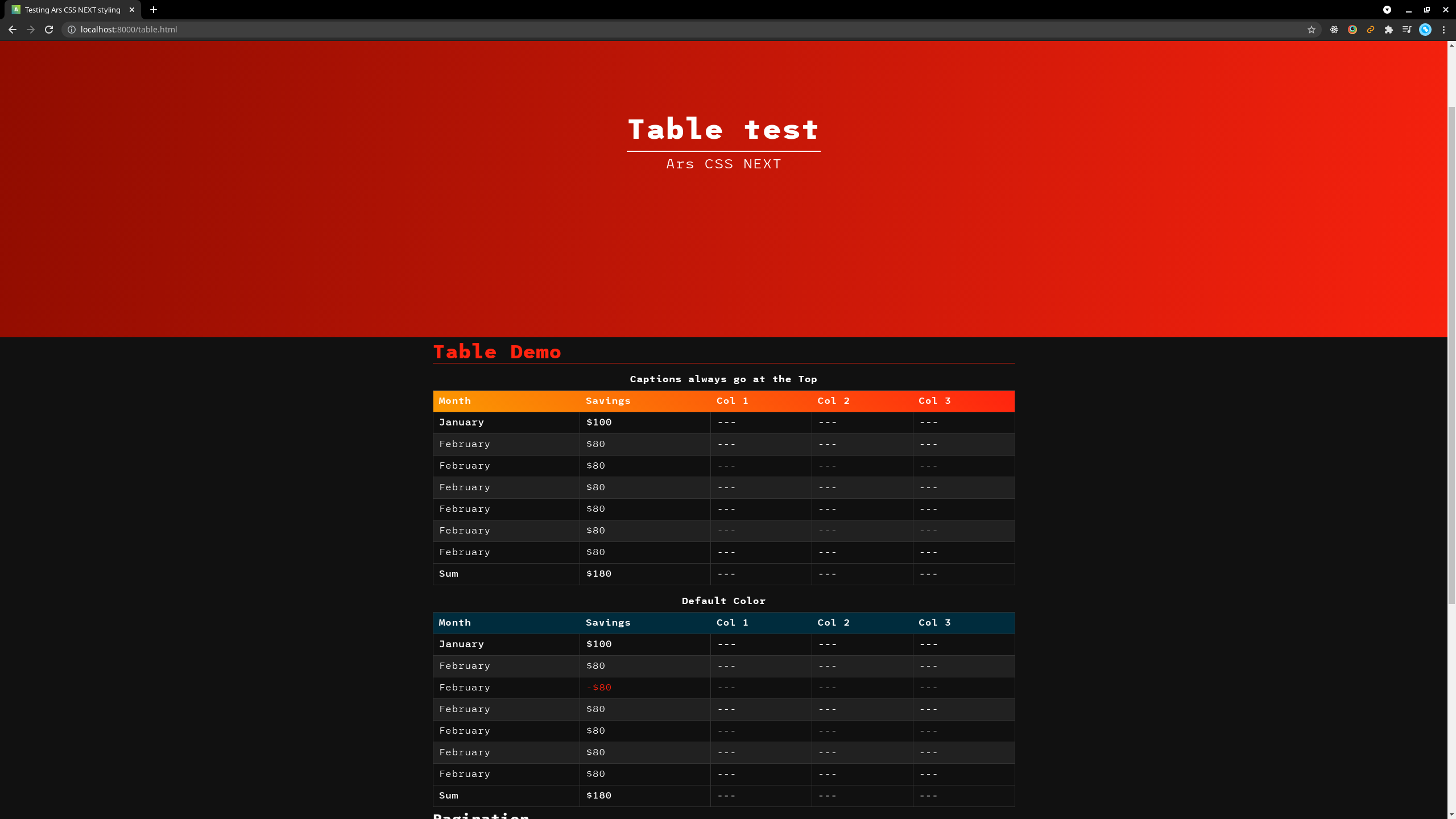
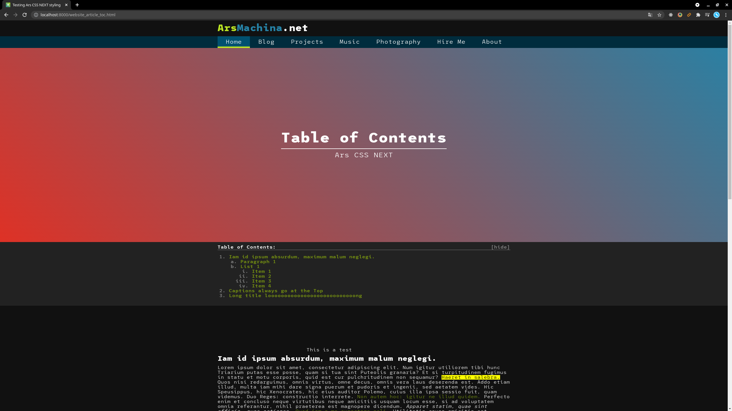
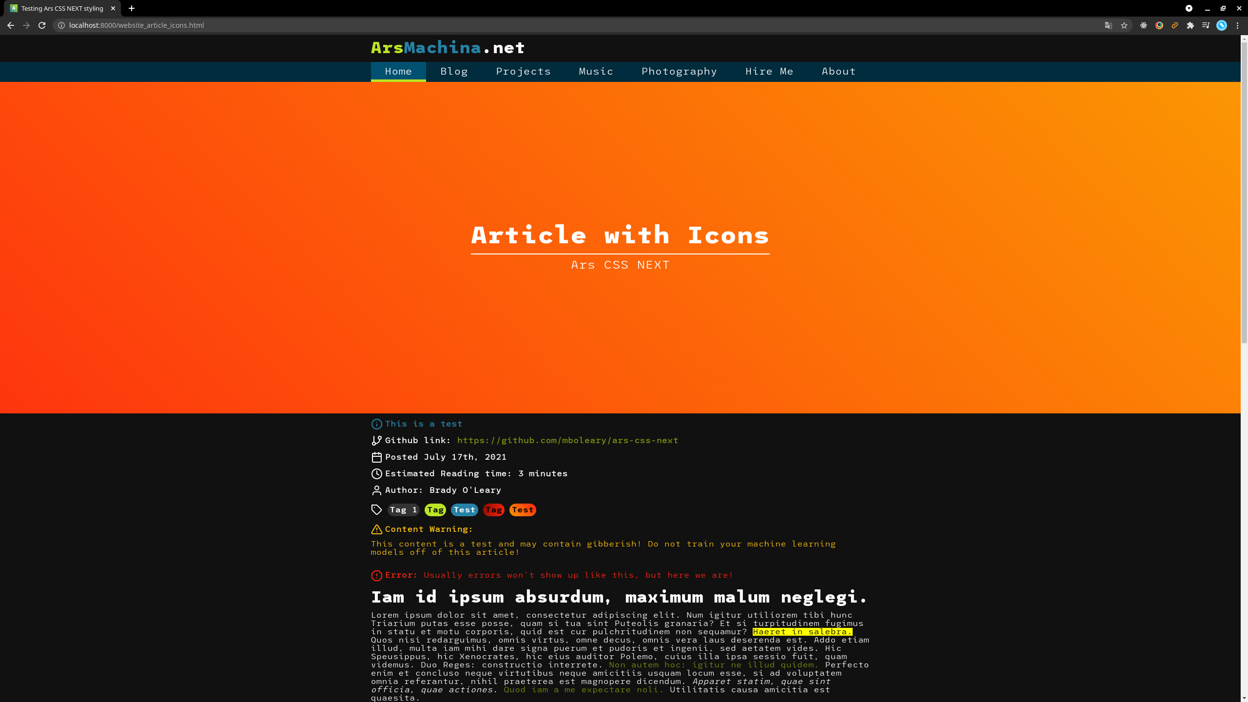
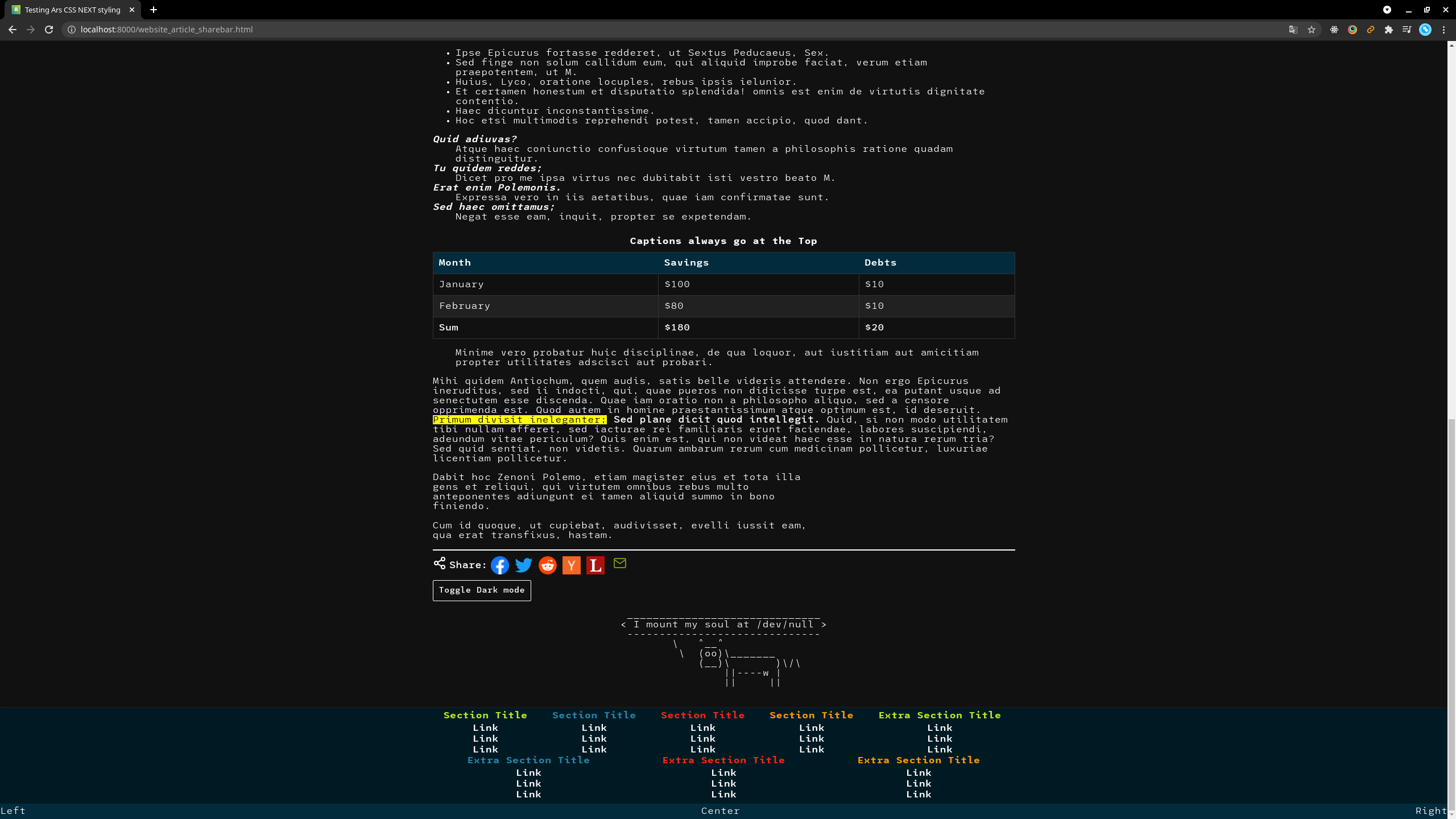
Ars Materia is the new theme that this website, as well as several other projects will use for styling. This redesign is similar in style to the old arsmachina styling, but is written in such a way that makes it easier to implement these styles elsewhere, as well as cut down on the number of files required to implement the styling, making it better to use on the web, and also to make the code more manageable.
Project History
This is a continuation of the style first written by me in 2018 for a reboot of a hackathon project that displayed the grade averages for each class at USC, as that data was publicly available. That template eventually became the base for a student organization website, acm.cse.sc.edu. After that, I also used the same template for this website which at the time hosted my portfolio for a New Media Arts class (MART380) that I took during my last semester of school, and my Graduation with Leadership Distinction portfolio as well which can be found at https://cse.sc.edu/~mboleary/. At the time I initially wrote the styling, I was less familiar with the web ecosystem, and best practices in writing CSS and managing that much styling which ultimately led to code that was difficult to manage and use elsewhere. That was one of many factors that led me to rewrite the website styling.
Project Goals
There were several shortcomings of the previous collection of css, WebTemplate including:
- A lack of portability
- Hard-to-manage code
- Lots of colors not in the theme, as well as some more janky code to calculate other related colors.
- A terrible color as the dark mode background
- Lots of files
There were also some features that I wanted implemented that I would have had a hard time doing with the old stylesheets including:
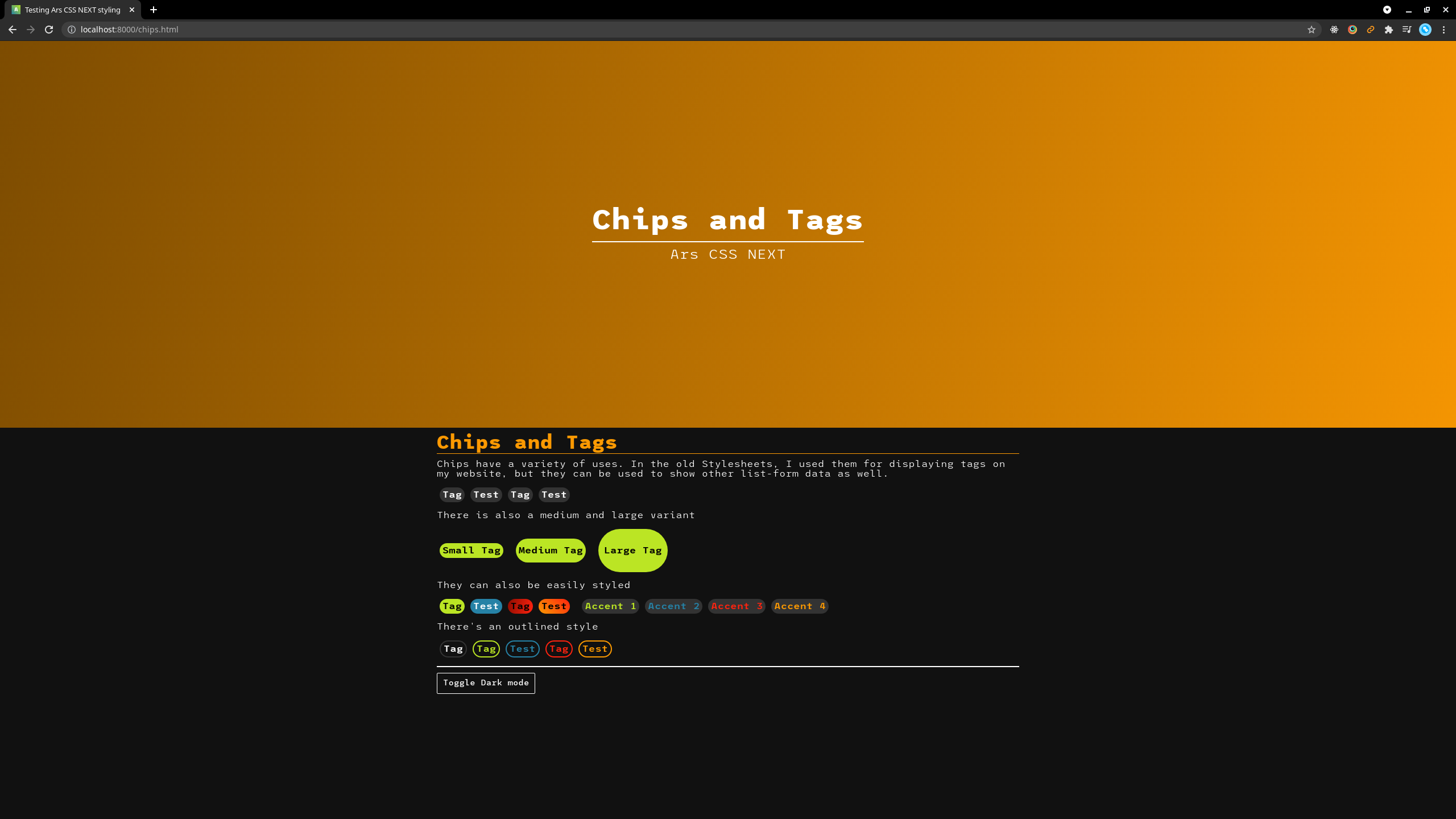
- Toggle-able dark mode (implemented using an attribute on the <body> tag)
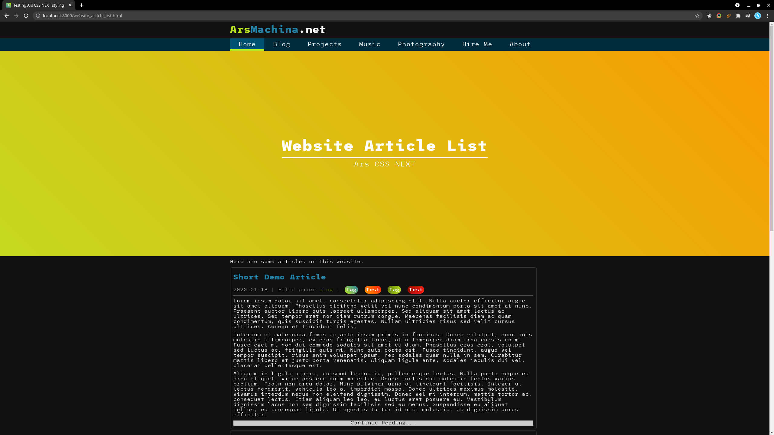
- Using the same header menu style on both the landing page (the one with just the cow, the title, and several buttons), and elsewhere on the website
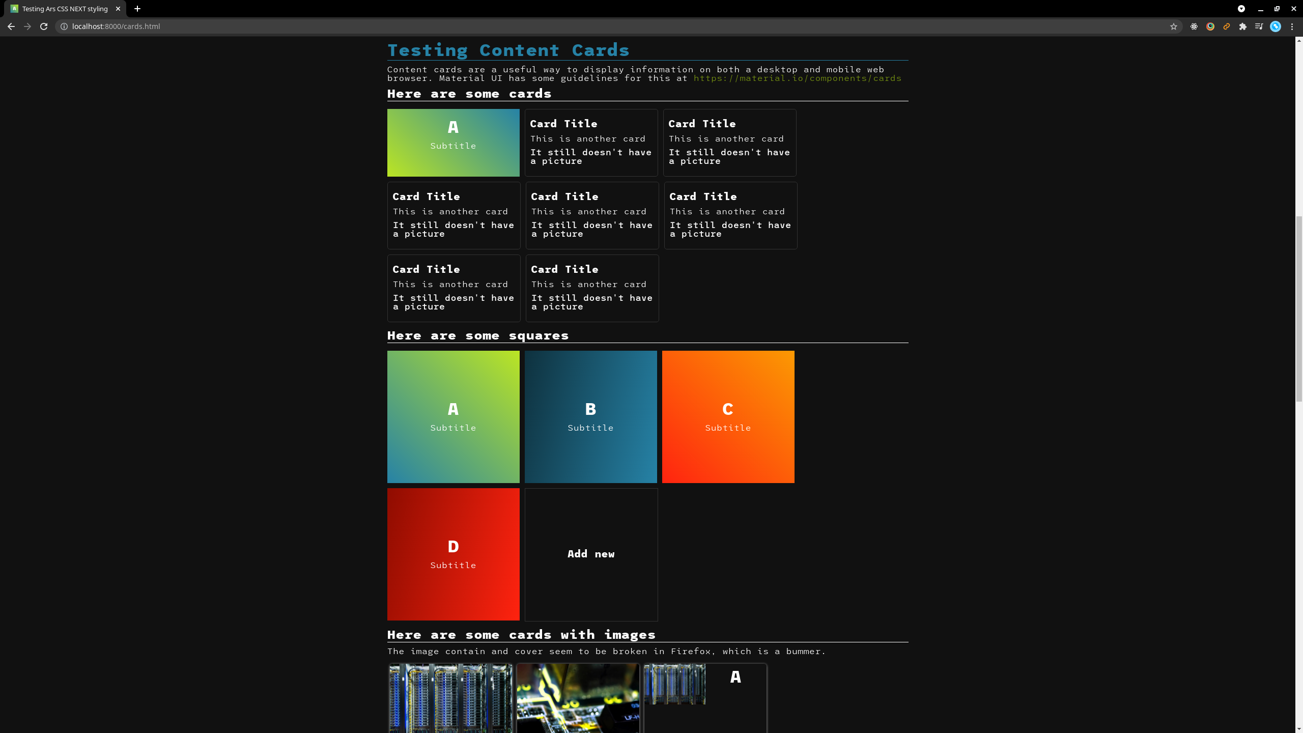
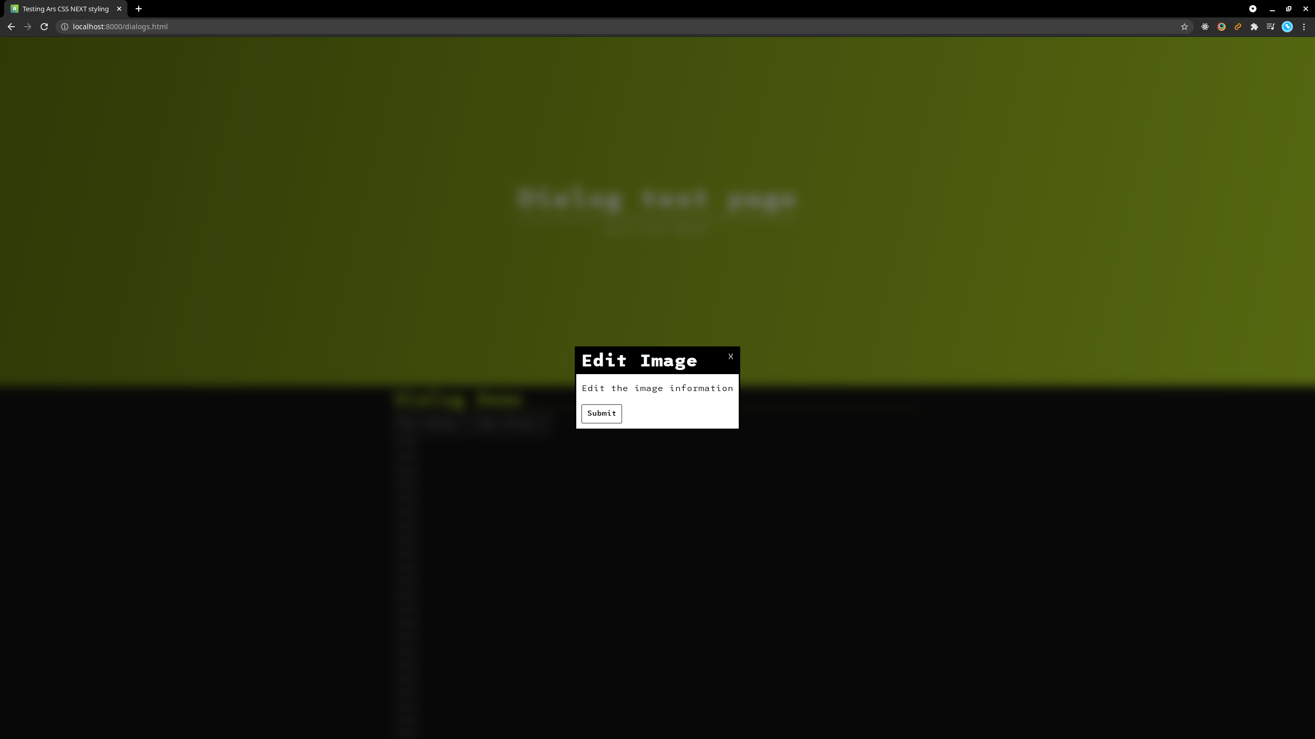
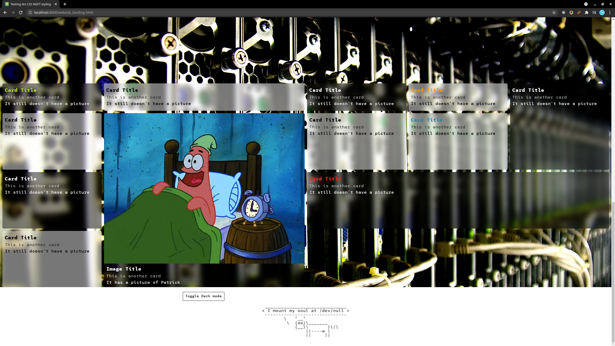
- Some content cards because no modern website is complete without cards
- Making the styling system more modular
- Learn SCSS, and see if using a preprocessor can help to make my code more manageable
What I learned
In embarking on this project, I learned that using a preprocessor like SCSS can help reduce the amount of code I need to manually write, and makes it much easier to package all of the styles in one file. I definitely should have started these stylesheets out like this.
Next steps
There are some bugs I need to work out before I can deploy these new stylesheets permanently on this website, and I also need to fix some hard-to-read text in a few places, as well as finish rebuilding the template to be compatible with these new changes.
Screenshots
